Help Center
Edit Tab Names & Order
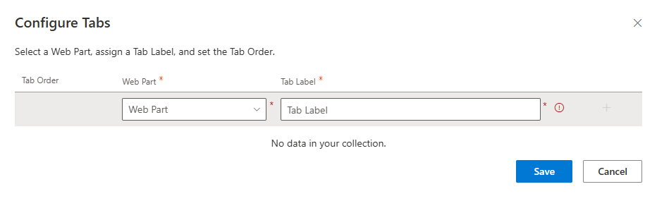
When you click the Edit Tab Names & Order button in the property pane, a panel opens where you can define the tabs for your web part.
The panel includes:
- Tab Order – A dropdown menu that allows a user to rearrange the display order of the tabs.
- Web Part – A dropdown or selector showing the web parts available in the section.
- Tab Label – A text field where you assign a custom name for the tab.
After entering the labels, click on the Add and save button to apply the changes.
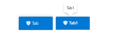
After saving the tabs will look like this on page with tooltip.
2. Icon for tabs
- Choose Icon for Tabs – You can add, select, or remove an icon for the tabs using this control. Clicking the button opens a panel presenting various icon options for selection.
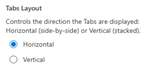
3. Tabs Layout
- Horizontal – Tabs appear in a row across the top of the section.
- Vertical – Tabs appear in a column on the left or right.
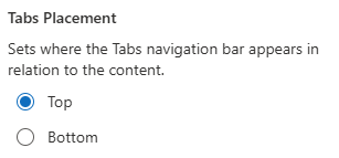
4. Tabs Placement
- Top – Option visible when horizontal is selected, Tabs are displayed above the content area.
- Bottom – Option visible when horizontal is selected, Tabs are displayed below the content area.
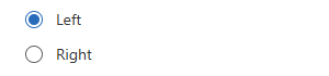
- Left – Option visible when Vertical is selected, Tabs are on the left, and the content is on the right.
- Right – Option visible when Vertical is selected, Tabs are on the right, and the content is on the left.
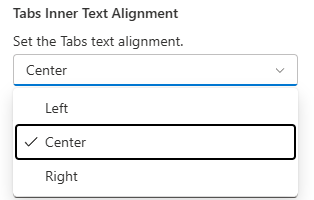
5. Tabs Inner Text Alignment
Choose to align tab labels to the Left, Center or Right.
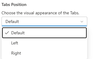
6. Tabs Position
Use this control to set the alignment of the tabs to the left, right, or default (centered) position.
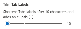
7. Trim Tab Labels
Set the maximum number of characters allowed before the text is shortened with an ellipsis (…).
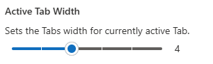
8. Active Tab Width
Adjust the specific width of the currently selected tab.
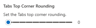
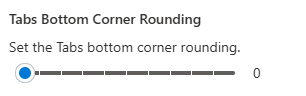
9. Tabs Corner Rounding
Set the tabs corner rounding or border radius of the tab.
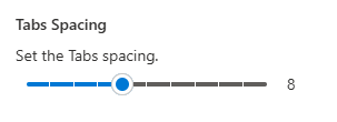
10. Tabs Spacing
With this control, users can manage tabs spacing.
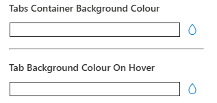
11. Tabs Style
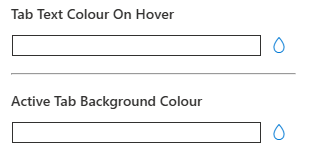
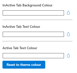
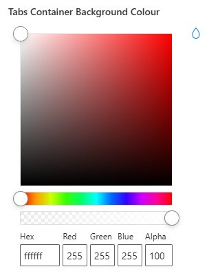
- Tab Styles – This control allows you to set custom colors for every tab state, including default, active, and hover. This enables you to easily achieve a fully branded, professional tab design. An additional option is provided to reset all colors to the defined theme color. Click on the drop icon to select color.
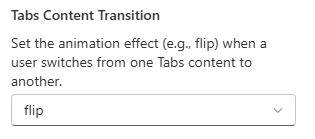
12. Tabs Content Transition
Select how content should appear when switching tabs.
Options may include:
- Fade – Smooth fade-in/out transition.
- Slide – Content slides in from the side.
- Flip – Adds card–flip animation Etc.